BRAND + IDENTITY
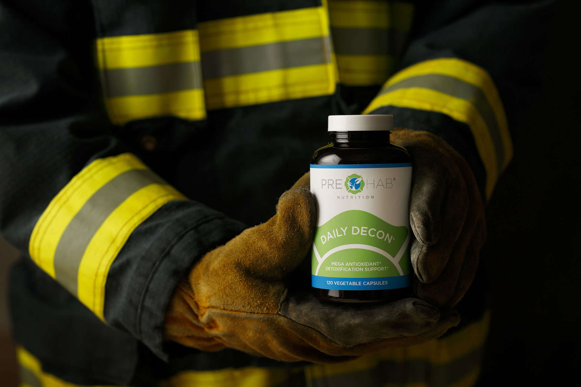
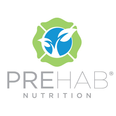
The founders of PreHab Nutrition bring years of fire fighting experience and nutritional supplement knowledge together to create an amazing product the combats workplace toxins for fire fighters and focuses on preventative as well as reparative health. Keeping their mission and target in mind, we created a visual identity that reflected who they are, what they do, and why they do it. The background shape, the Maltese Cross, is the universal symbol of firefighters (the key target audience for initial launch). The foreground element brings in the natural elements of growth, green, health. Uniting these symbolic elements increases the visual statement and ties the product brand to the consumer.
“What Lewis Creative produced for us has helped lay the groundwork for our entire branding concept for our new business that we are still building.”
Darrin Deming, PreHab Nutrion
DIGITAL + PRINT
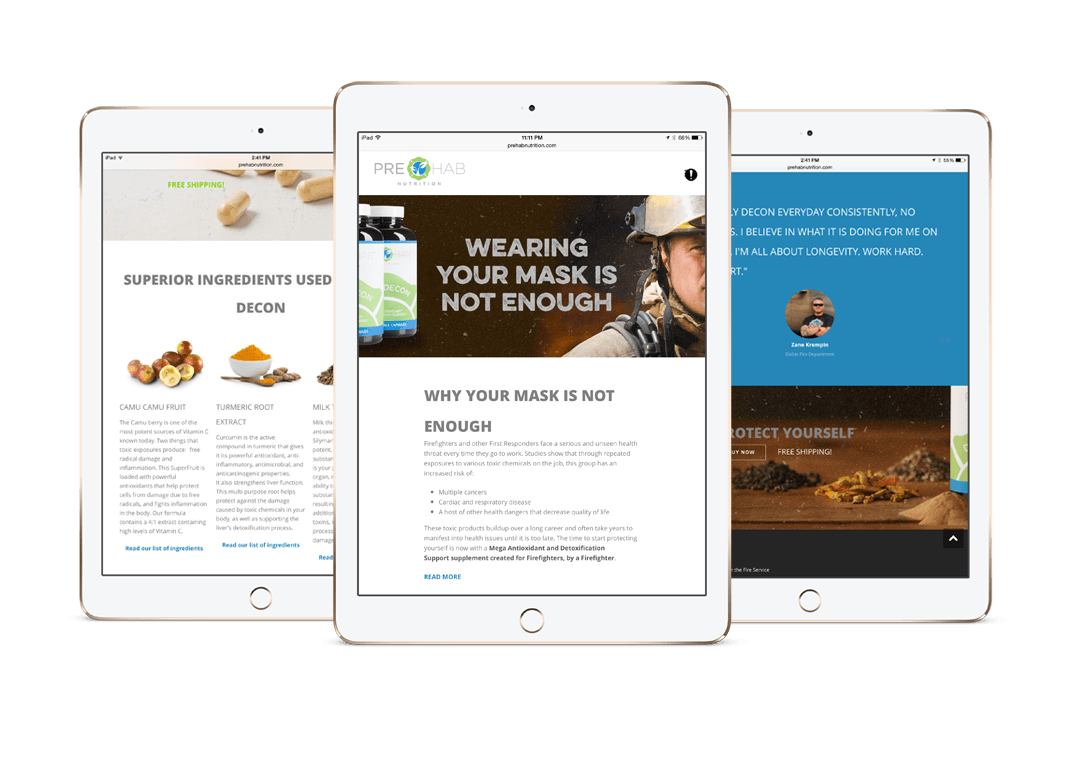
We created a responsive, e-commerce website that PreHab could manage and maintain in-house. This site has room to grow as PreHab introduces new products to the market. We also create a business system, sales collateral, and simple trade show graphics. We loved working with a start up from the very beginning.
PACKAGING
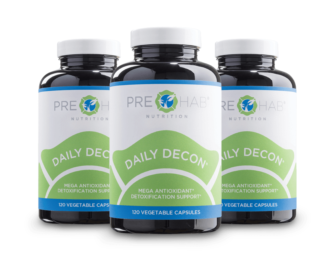
PreHab Nutrition put a lot of energy into every detail of their first product Daily Decon. We wanted to create packaging that would reflect the quality and power of the product inside. Our first priority was to create brand awareness by keeping the packaging clean and simple. It also needed to stand out from the typical (and overly cluttered) nutrition supplement market. With final designs, test markets, and client approval in hand, we called upon our long-time friends at Taylor Made Labels to produce flawless full color labels. We couldn’t have been more thrilled with the final product.
