6 Lessons Learned From Our Own Rebrand
This summer Lewis Creative will celebrate 15 years of business. To mark this milestone, we put our brand under the microscope and decided it was time for a good brand refresh. So we settled into the client seat and held on tight for the ride of our professional lives. Here are some of the key things we learned from our rebrand.
It’s been said that to understand someone, you must walk a mile in their shoes. To sit in the client seat and go through the systematic process we put our clients through was… well, at times… kinda painful. I can honestly say that we have a new perspective and even empathy for anyone going through branding, rebranding, and launch. In the end (through all the stress and fears) we are happy we survived and thrilled with the end results .

1. Hire a professional and trust them.
It is really hard to design for yourself. We were too close to the problem to clearly see the solutions. We had the brainstorming session, mapped out the scope, set the timeline, and began design work. It didn’t take long for us to figure out that we’re the WORST client we have ever had… nothing was good enough and deadlines were pushed because we couldn’t make decisions in a timely manner. So the project sat. And it sat. Weeks ticked by, and turned into months with no progress on the new brand and site launch. We had the bones, strategy, and designs in hand, but recognized it was time to outsource a bit.
With the help from our trusted parter at Embrace Flux, we refined the brand message, cleaned up the website structure, and simplified our service offering and case studies. With the colors, fonts, and content finalized we then sought guidance from our SEO guru (The Oracle) at Columbia SEO Consulting. By seeking out and engaging trusted professionals, we were able to whip the brand into shape and prepare the site for launch within hours. Hours! Not days, weeks, or months!
It really does pay to seek out the best professional help you can afford. You can be assured that it will be done right, work beautifully, use current technology, and align with industry best practices. Plus, it freed us up to do what we do best… design for other people!
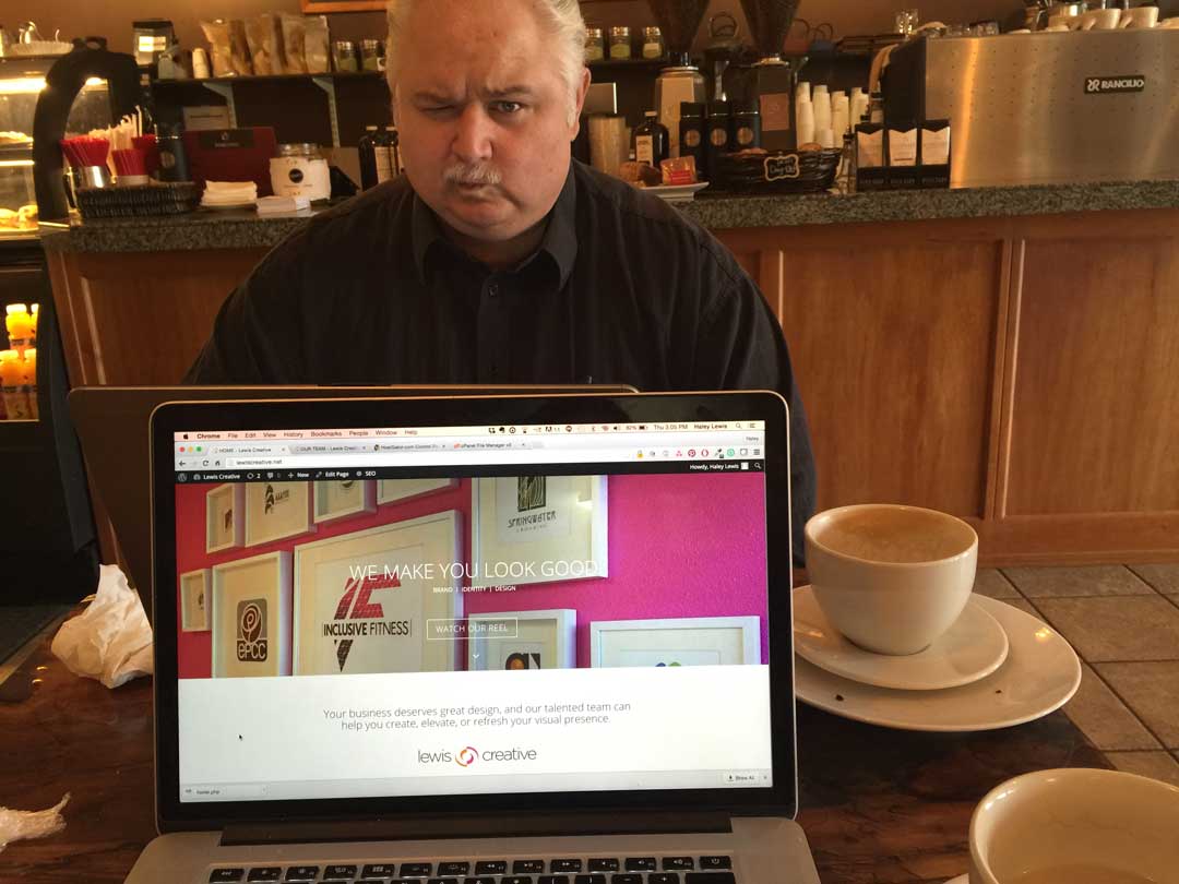
Al Wagner from Columbia SEO giving our site a thorough review before launch.
2. Mistakes are valuable learning moments.
There were so many learning moments during our rebrand. We are used to designing within our clients’ brand guidelines that we often lost sight of our own brand. We redesigned the case studies several times until we figured out how to highlight our client work and still maintain our own brand presence.
Another big learning moment: always back up your old materials and messaging. You never know when you might need to refer to them when building your new messaging. Yep, that lesson stung a bit. Sometimes the process seemed like an endless cycle of re-dos, but it was those very (gut-wrenching) moments that helped us forge the final product and gave us a war chest of priceless experience.
3. Let go… honor the old and embrace the new.
This can be scary and I feel your pain on this one. We had to pry our death grip from some elements of our old brand. It had served us well and faithfully for nearly 15 years. It had been there from the beginning and had weathered the growing pains of those first few years. It was with us when we jumped from the safety of our cushy corporate jobs and helped lend credibility to land our first big client.
How do you transition to a new visual brand and still honor the old? For us the solution was to keep the “eye-con”, modify the shape a bit, add the new color palette, and update the typography.
ORIGINAL LOGO
The original logo was created by adding a customized “LC” in a swirling yin-yang style to create the eye icon (eye-con). This highlighted the initials of the company, symbolized the founding partners, and tipped a hat to the tagline: We make you look good. The type was set in a combination upper and lowercase Helvetica in two font weights, then customized to make an original lototype. We used a soft color palette of brown, aqua, and gold to highlight our friendly style.
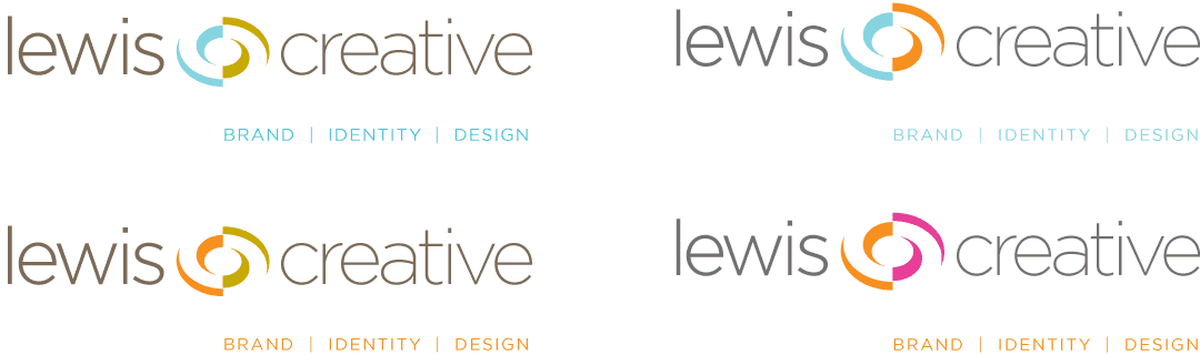
COLOR AND TYPOGRAPHY STUDY
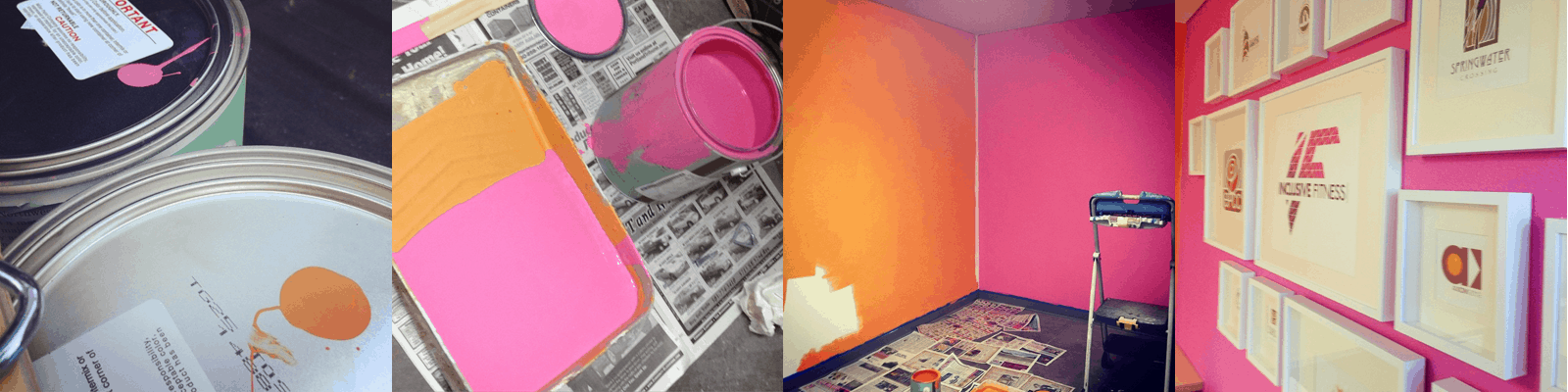
We wanted to lighten up the look of the logo through the use color and type. Setting the name in a light san serif font (Gotham Light/Extra Light) was the first step. From there we brightened the light blue, swapped out the gold for orange, and ultimately landed on a fun bright pink and orange combination. Why orange and pink? Well, because it made us happy to look at… and we took inspiration from the mid-mod color schemes of Alexander Girard. (The Endless Summer movie poster may have influenced us a bit too!)
ICON RESIZE
Open your eyes! The original design was a bit squinty, squished, and timid. By opening up the eye-con we created a fuller and rounder design that flows with the new type treatment.
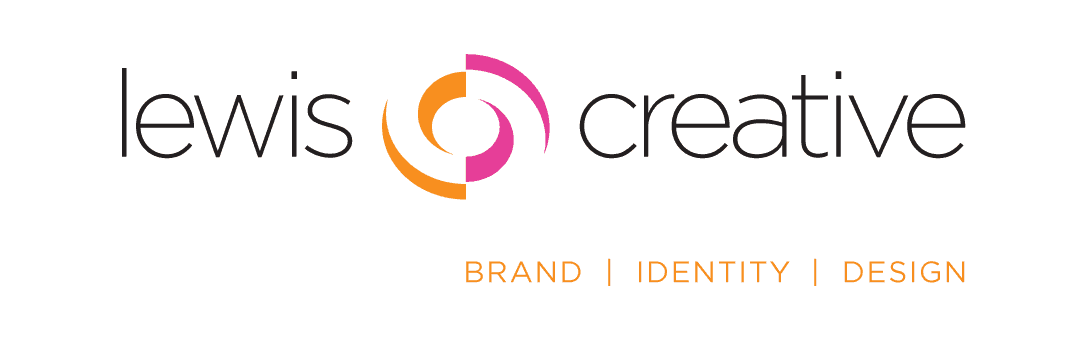
FINAL LOGO
Putting all the elements together gave the mark a significant refreshed design without losing the brand equity of the the original mark. It is now bright and fresh, and most importantly… it makes us happy.
4. Trust your gut… you know your brand better than anyone else.
If you are a small business, you are your brand. It is a direct reflection of who you are, what you value, and how you operate your business. The brand or rebrand should fit your personality, so you know when it feels right.
The decision to switch our brand colors to bright pink and orange just felt right despite some raised eyebrows. Hot pink is not right for everyone, but for us it had the right vibe and we committed to the new color with full force. On the eve of launching our new brand and site, I look over all our visual elements and can’t imagine our brand being anything else. When it’s right, you will know. So trust that instinct… it will not lead you astray.
5. Keep it simple, silly.
You can’t be everything to everyone. Pick what you do best and own it. The “less is more” motto came into play several times during our rebrand. It is easy to get caught up in every detail and try to add it all to your brand story. Our website refresh came to a complete standstill when we started to create 9 pages outlining each minute detail of the creative services we offer. It was a clunky and confusing mess… even to us. And if we couldn’t navigate our services, potential clients would get completely overwhelmed and leave our site. Balancing what we offer with what clients need, we were able to simplify our services into 3 main sections. The whole process found it’s natural rhythm, and we were back on track headed for relaunch.

6. Quit stalling and pull the trigger.
Our rebranding process bounced from exciting to frustrating to overwhelming, and back to exciting. But… launching is terrifying. We have seen this happen to some of our clients, but were completely unprepared for launch phobia to strike us. The thought of putting it out there and making it real somehow makes you feel really vulnerable. This is where we go full circle back to lesson number one… get professional help. Our trusted partner said, “Quit fussing. It’s good. Really good.”
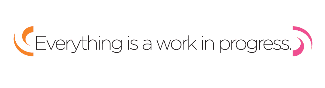
Life is not perfect, and your rebrand won’t be perfect either. Your brand shouldn’t be perfect… Before you send me hate mail, let me explain… Your brand is a living thing that needs to adapt and bend as your business grows. “Perfect” would freeze your brand and lock it into one moment of perfection. However, tomorrow your idea of perfection may be different. Be flexible. Be patient. Be willing to take risks and put your brand out there. It’s not perfect, but it works… Launch!
Welcome to our new brand! Enjoy our site. Let us know what you think and how we can make you look good.